|
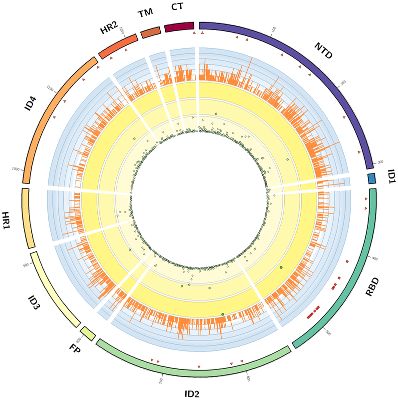
I have been meaning to make the first entry in this blog for a long time but never quite got around to it. I am finally taking the plunge with an entry involving the creation of a Circos plot to display mutations that have been identified in the spike protein of the SARS-CoV-2 virus. As part of my fall 2020 course in 'protein structure and function for the life sciences' (CHEM 440) at CSUSM we looked at the mutations (amino acid changes) found in the spike protein of the SARS-CoV-2 virus. From the NCBI virus database (https://www.ncbi.nlm.nih.gov/sars-cov-2/) we obtained the amino acid sequences for the SARS-CoV-2 spike protein from approximately 31,000 patient samples isolated from around the globe. These protein sequences were compared to the reference sequence of the spike protein (YP_009724390), from the virus isolated from Wuhan China in December of 2019, to identify amino acids that have changed in the spike protein since the original identification of the virus. We did the analysis using a python script we developed as part of the class discussion. Once the sequences were analyzed we discussed how best to display the data. There are several different ways to look at the data. For example, how many sequence positions in the protein have changed from the original strain? How many positions have never changed? Is a particular mutation found in a significant number of samples? We started to generate plots to answer these questions. A student mentioned that we may be able to use Circos to display all of the data in a visually appealing way. Circos (http://circos.ca) is a way to visualize data using a circular layout. Circos was originally developed to visualize genomic data but has been used to visualize data in a number of other fields. Using the data we obtained from our sequence analysis we developed a visualization to display the domains of the protein, the sites of glycosylation, the sites involved in receptor binding, the number of unique mutations at a given position, and the number of samples in which a given mutation is found. The Circos websites offers an extensive collection of tutorials with code examples that helped me develop the visualization shown below.  Circos Plot of information for the SARS-Cov-2 spike protein. Moving from the outer ring to the innermost ring: (1). The domains of the SARS-CoV-2 spike protein (NTD - N-terminal domain, ID - inter-domain, RBD - receptor binding domain, FP - fusion peptide, HR - heptad repeat, TM - transmembrane, and CTR - C-terminal) (2) Triangles - sites of glycosylation (3) circles - receptor binding residues (4) Histogram plot of the number of unique mutations observed for each position of the spike protein (5) scatter plot of the sequence positions with mutations that appear in between 500 - 31,000 samples (6) scatter plot of the sequence positions with mutations that appear in 100 - 500 samples, and (7) scatter plot of the sequence positions with mutations that appear in between 0-100 samples. The discussion that lead to this analysis was not a main focus of the CHEM 440 class. As part of the main content of the class students were introduced to the main concepts of protein structure, techniques used to investigate protein structure, and bioinformatics tools used to retrieve, analyze and visualize protein sequences (PIR database, pairwise and multiple sequence analysis, JalView, PyMol), and concepts of protein function. Throughout the semester we discussed how these concepts introduce in class can be applied to investigate proteins found in the SARS-CoV-2 virus. Based on these discussions I started a voluntary project to analyze SARS-CoV-2 spike protein sequences to identify mutations that have occurred since the virus was first identified. The main focus of this mini-project was writing a short python script to read a FASTA file, to compare each spike protein sequence to the reference sequence, and to identify the amino acid positions that have mutated. I made this project voluntary because not all students in the class were interested in learning how to code using python. Once the python script was developed and we had analyzed the spike protein sequences we discussed the major findings and how best to visualize the data. A couple of students presented the data as a poster at the campus Student Research Poster Showcase. These students are interested in continuing the analysis of this data outside of the classroom and the project has now become part of my online bioinformatics research efforts.
Overall this mini-project was a nice way to introduce students to python and to make it relevant by looking at a current topic.
2 Comments
|
ArchivesCategoriesAuthorHi, my name is Sajith Jayasinghe and I am faculty member in the department of Chemistry and Biochemistry at California State University, San Marcos, CA. My faculty information can be found at https://faculty.csusm.edu/jayasinghe/index.html and details of my research efforts can be found at public.csusm.edu/jayasinghe/ |
Site powered by Weebly. Managed by Bluehost
 RSS Feed